Creating choropleth map with geopandas and matplotlib
Introduction
Choropleth maps can easily capture attention. They’re also not too complicated to make. The 2 pieces of data required are (1) geographical polygons and (2) values that correspond to the color on the map.
Getting geojson files
Raw geojson files can be download from https://gadm.org/maps.html. I’ve done some preprocessing to remove small islands to declutter the map.
Barebone example
import geopandas as gdp
from unidecode import unidecode

import matplotlib.pyplot as plt
import pandas as pd
gdf = gdp.read_file('vietnam.geojson')
gdf.plot()

Adding data to chart
Plotting raw geojson file. By default, all polygons are filled with the same color.
We can specify individual color for each polygon, but it’s cumbersome.
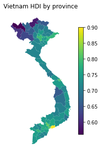
Instead, I’m going to use Human Development Index (HDI) to make a choropleth map.
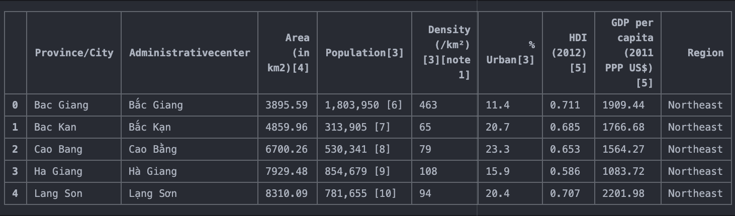
Fetch data from wikipedia using pandas’ read_html method.
dfs = pd.read_html('https://en.wikipedia.org/wiki/Provinces_of_Vietnam')

# the 4th table contains province level data such as area, HDI, GDP per capita)
df = dfs[4]
df.head()
Data cleaning: removing extra words and standardize spellings.
df['Province/City'] = df['Province/City'].str.replace(' Province', '').str.replace(' City', '').apply(unidecode)
df['Province/City']= df['Province/City'].replace({'Ba Ria-Vung Tau': 'Ba Ria - Vung Tau', 'Thua Thien-Hue': 'Thua Thien Hue'})
df.head()
gdf['HDI'] = gdf['en-1'].map(pd.Series(df['HDI (2012)[5]'].values, index=df['Province/City'].values).to_dict())

fig, ax = plt.subplots(figsize=(3,8));

ax.axis('off')
ax.set_title('Vietnam HDI by province', loc='left')
gdf.plot(
    ax=ax,
    column='HDI',
    vmin=.56,
    vmax=.9,
    legend=True,
    legend_kwds={'shrink': .5},
    );